
The play space design for Primrose Park began with me googling images of flowers--specifically, the Camellia and Primrose. These flowers represented the City of Temple City, in Los Angeles County. The flowers adorn the City seal and logo, and are also incorporated into much of the city's communications, signage, and more.


David Volz Design, an award-winning landscape architecture firm based out of Southern California, reached out to us for help in designing the play space. The city had received Prop 68 Funding to build their first new park for the community in over 40 years, and the playground was to be the centerpiece of the design. There was a lot of excitement and expectation from all the stakeholders. This play space needed to be unique, visually impactful, and oh yeah... it also needed to be completely shaded.
This last requirement posed a challenge: What's the point of designing an incredible, one-of-a-kind playground structure, only to cover it with shade sails? Freestanding shade sails can be architecturally interesting, but they will always just be geometric shapes of colored fabric layered over a playground at varying heights and angles--hiding the incredible design work beneath them.

But what if we made the problem the solution? What if the most unique and visually impactful element was the shade itself? And what if that shade wasn't a separate element at all, but rather integrated into the design of the structure itself?
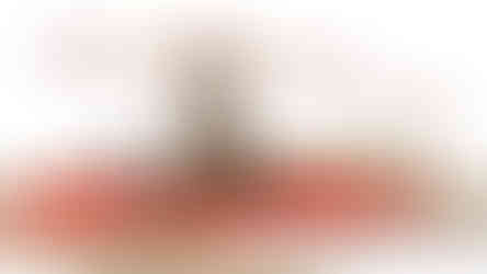
We got to work with our incredible design team at Landscape Structures. We developed a concept with custom playground designer, John Fischer, that borrowed from a free standing flower shade structure that we had created for another project (see image above). We'd enlarge it, and place it on top of our 10' tall Play Odyssey Tower. The city and design team at David Vols Design signed off on the concept, and we created our first renders:


While impactful and unique, David Vols Design pushed us further. The first pass was a bit "clunky" and didn't feel organic. It needed more shape, a truer color palette, and some "flower friends" to help with scale. We got to work, and after a few more revisions, we were close:


This revision had it all, and then some! It was epic, it was impactful, it felt like a real flower, and even had flower friends! But there was just one major problem-- it blew the budget. The more organically shaped petals and layers were incredible, but also expensive. That said, we had certainly moved in the right direction. Along with the reducing the budget, we needed to tweak the colors, and find a few interesting ways to incorporate the City's logo more explicitly into the design. We worked hard to maintain as much of the design as we could while reducing the cost and what we ended up with was actually quite perfect!


My fondest memory of this project was when the City's project manager called me once installation was complete and incredulously repeated, "Nate, it looks just like the renders! Just like the renders!" Nothing makes me happier. We take pride in making sure that the finished product is even more impressive than the renders, and we certainly succeeded on this one!


THANK YOU TO THE TEAM!
There are many people who helped bring this project together. Huge thank you to the City of Temple City and David Vols Design for trusting us to help bring this design to life! Thank you to the design team at Landscape Structures and SkyWays for bringing concepts a reality. Lastly, a big thank you goes out to Tito Carrillo and the CEM Construction team for crushing the installation of this epic structure!
For more information on this project or any others, please feel free to reach out to me here.
Comentarios